COLOR K!D
COLOR K!D
Client
COLOR K!D
Year
2024
Location
Germany
COLOR K!D is a DJ and music producer from North Rhine-Westphalia, Germany, whose mission is clear: to spread joy, positivity and energy through music. With a sound marked by electronic beats and infectious melodies, his work seeks not only to entertain, but to inspire, elevating the audience to states of euphoria, enthusiasm and genuine emotional connection. COLOR K!D represents a vibrant and free lifestyle that celebrates authenticity, optimism and experimentation. With a young and connected audience, his brand positions itself as an energetic reference in the music scene, merging the universe of the dance floor with urban and psychedelic aesthetics in a unique and captivating way.
COLOR K!D is a DJ and music producer from North Rhine-Westphalia, Germany, whose mission is clear: to spread joy, positivity and energy through music. With a sound marked by electronic beats and infectious melodies, his work seeks not only to entertain, but to inspire, elevating the audience to states of euphoria, enthusiasm and genuine emotional connection. COLOR K!D represents a vibrant and free lifestyle that celebrates authenticity, optimism and experimentation. With a young and connected audience, his brand positions itself as an energetic reference in the music scene, merging the universe of the dance floor with urban and psychedelic aesthetics in a unique and captivating way.

Concept
Concept
COLOR K!D's visual identity was built based on a visual translation of the artist's mission to connect people through music, color and shared energy. The project is based on the idea that COLOR K!D's music not only reverberates in space, but creates bonds, sensations and moments that remain in the memory. This concept is materialized in a visual aesthetic that combines boldness and lightness: original typography based on modular square grids, an irreverent smile as the central symbol and a psychedelic gradient of purple, cyan and lime green that reinforces the brand's vibrant energy.
COLOR K!D's visual identity was built based on a visual translation of the artist's mission to connect people through music, color and shared energy. The project is based on the idea that COLOR K!D's music not only reverberates in space, but creates bonds, sensations and moments that remain in the memory. This concept is materialized in a visual aesthetic that combines boldness and lightness: original typography based on modular square grids, an irreverent smile as the central symbol and a psychedelic gradient of purple, cyan and lime green that reinforces the brand's vibrant energy.

Logo
Logo
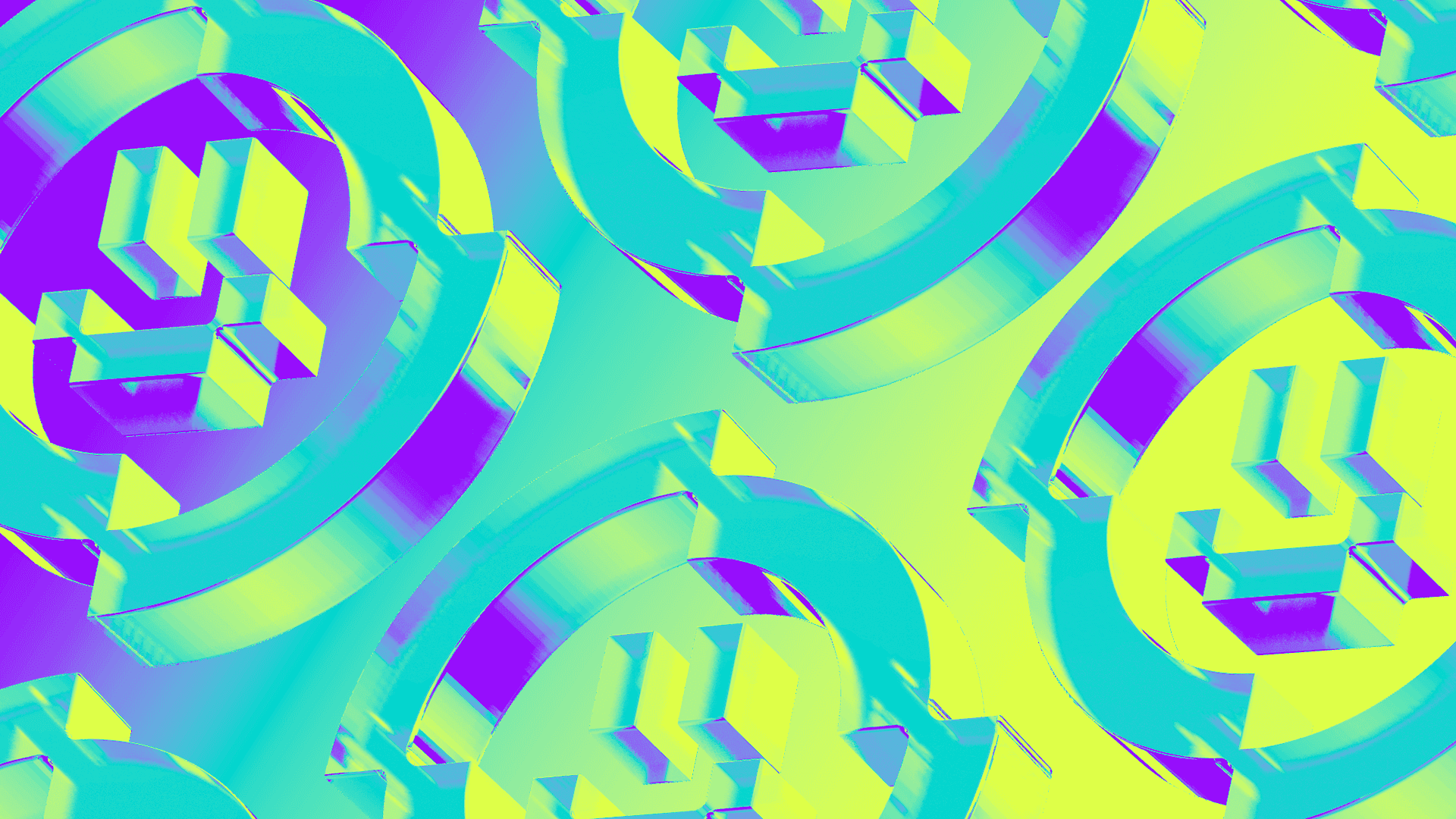
The logo was developed from scratch using a modular square grid, with a focus on structural precision and visual coherence. The presence of subtle ink traps reinforces the contemporary and timeless character of the design. The symbol that accompanies the logo is a smiley face with an irregular outline, creating an abstract “C” formed by ellipses of varying sizes. It symbolizes the reverberation of sound and the expansion of energy, essential elements of the COLOR K!D musical experience. Versatile, the symbol can be used independently or integrated, reinforcing the brand identity in different contexts.
The logo was developed from scratch using a modular square grid, with a focus on structural precision and visual coherence. The presence of subtle ink traps reinforces the contemporary and timeless character of the design. The symbol that accompanies the logo is a smiley face with an irregular outline, creating an abstract “C” formed by ellipses of varying sizes. It symbolizes the reverberation of sound and the expansion of energy, essential elements of the COLOR K!D musical experience. Versatile, the symbol can be used independently or integrated, reinforcing the brand identity in different contexts.


Visual Identity
Visual Identity
The visual identity was designed to be dynamic and versatile. The color palette, composed of purple, cyan and lime green, with black as the base color, brings intensity and movement when applied in gradients. This combination evokes a psychedelic and energetic aesthetic, ideal for representing the atmosphere of the artist's sets and stage presence. In three-dimensional applications, the logo comes to life on dark backgrounds, with vibrant transitions that reinforce the brand's nocturnal and contemporary aesthetic. The result is a vibrant, expansive and recognizable identity.
The visual identity was designed to be dynamic and versatile. The color palette, composed of purple, cyan and lime green, with black as the base color, brings intensity and movement when applied in gradients. This combination evokes a psychedelic and energetic aesthetic, ideal for representing the atmosphere of the artist's sets and stage presence. In three-dimensional applications, the logo comes to life on dark backgrounds, with vibrant transitions that reinforce the brand's nocturnal and contemporary aesthetic. The result is a vibrant, expansive and recognizable identity.


Credits
Credits
Creative Direction and Design: Matheus Ferreira Design and Motion: Pedro Ramon
( EXPLORE OUR WORK )
See More Projects…


matheusferreira.co
We specialize in strategically designed brands, visual identities, and packaging.
MATHEUS FERREIRA & CO
MATHEUS FERREIRA & CO • ALL RIGHTS RESERVED
© 2026
COLOR K!D
COLOR K!D
Client
COLOR K!D
Year
2024
Location
Germany
COLOR K!D is a DJ and music producer from North Rhine-Westphalia, Germany, whose mission is clear: to spread joy, positivity and energy through music. With a sound marked by electronic beats and infectious melodies, his work seeks not only to entertain, but to inspire, elevating the audience to states of euphoria, enthusiasm and genuine emotional connection. COLOR K!D represents a vibrant and free lifestyle that celebrates authenticity, optimism and experimentation. With a young and connected audience, his brand positions itself as an energetic reference in the music scene, merging the universe of the dance floor with urban and psychedelic aesthetics in a unique and captivating way.
COLOR K!D is a DJ and music producer from North Rhine-Westphalia, Germany, whose mission is clear: to spread joy, positivity and energy through music. With a sound marked by electronic beats and infectious melodies, his work seeks not only to entertain, but to inspire, elevating the audience to states of euphoria, enthusiasm and genuine emotional connection. COLOR K!D represents a vibrant and free lifestyle that celebrates authenticity, optimism and experimentation. With a young and connected audience, his brand positions itself as an energetic reference in the music scene, merging the universe of the dance floor with urban and psychedelic aesthetics in a unique and captivating way.
Concept
Concept
COLOR K!D's visual identity was built based on a visual translation of the artist's mission to connect people through music, color and shared energy. The project is based on the idea that COLOR K!D's music not only reverberates in space, but creates bonds, sensations and moments that remain in the memory. This concept is materialized in a visual aesthetic that combines boldness and lightness: original typography based on modular square grids, an irreverent smile as the central symbol and a psychedelic gradient of purple, cyan and lime green that reinforces the brand's vibrant energy.
COLOR K!D's visual identity was built based on a visual translation of the artist's mission to connect people through music, color and shared energy. The project is based on the idea that COLOR K!D's music not only reverberates in space, but creates bonds, sensations and moments that remain in the memory. This concept is materialized in a visual aesthetic that combines boldness and lightness: original typography based on modular square grids, an irreverent smile as the central symbol and a psychedelic gradient of purple, cyan and lime green that reinforces the brand's vibrant energy.
Logo
Logo
The logo was developed from scratch using a modular square grid, with a focus on structural precision and visual coherence. The presence of subtle ink traps reinforces the contemporary and timeless character of the design. The symbol that accompanies the logo is a smiley face with an irregular outline, creating an abstract “C” formed by ellipses of varying sizes. It symbolizes the reverberation of sound and the expansion of energy, essential elements of the COLOR K!D musical experience. Versatile, the symbol can be used independently or integrated, reinforcing the brand identity in different contexts.
The logo was developed from scratch using a modular square grid, with a focus on structural precision and visual coherence. The presence of subtle ink traps reinforces the contemporary and timeless character of the design. The symbol that accompanies the logo is a smiley face with an irregular outline, creating an abstract “C” formed by ellipses of varying sizes. It symbolizes the reverberation of sound and the expansion of energy, essential elements of the COLOR K!D musical experience. Versatile, the symbol can be used independently or integrated, reinforcing the brand identity in different contexts.
Visual Identity
Visual Identity
The visual identity was designed to be dynamic and versatile. The color palette, composed of purple, cyan and lime green, with black as the base color, brings intensity and movement when applied in gradients. This combination evokes a psychedelic and energetic aesthetic, ideal for representing the atmosphere of the artist's sets and stage presence. In three-dimensional applications, the logo comes to life on dark backgrounds, with vibrant transitions that reinforce the brand's nocturnal and contemporary aesthetic. The result is a vibrant, expansive and recognizable identity.
The visual identity was designed to be dynamic and versatile. The color palette, composed of purple, cyan and lime green, with black as the base color, brings intensity and movement when applied in gradients. This combination evokes a psychedelic and energetic aesthetic, ideal for representing the atmosphere of the artist's sets and stage presence. In three-dimensional applications, the logo comes to life on dark backgrounds, with vibrant transitions that reinforce the brand's nocturnal and contemporary aesthetic. The result is a vibrant, expansive and recognizable identity.
Credits
Credits
Creative Direction and Design: Matheus Ferreira Design and Motion: Pedro Ramon
( EXPLORE OUR WORK )
See More Projects…
matheusferreira.co
We specialize in strategically designed brands, visual identities, and packaging.
MATHEUS FERREIRA & CO
ALL RIGHTS RESERVED
© 2026