Dra. Carolina Puentes
Dra. Carolina Puentes
Client
Dra. Carolina Puentes
Year
2024
Location
Brazil
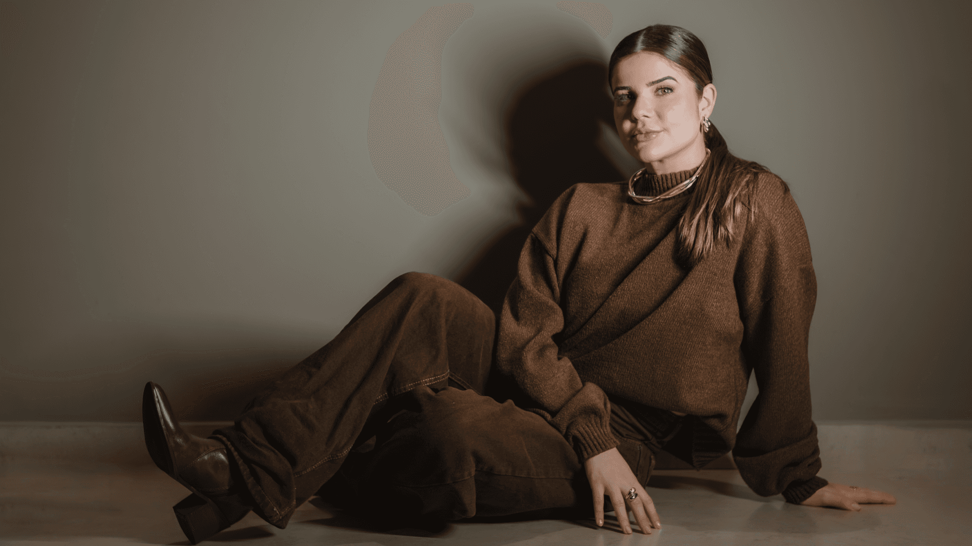
Dr. Carolina Puentes is a dental surgeon specializing in orofacial and body harmonization. Her brand was created to convey confidence, empathy, and excellence, valuing a human and transformative approach in every aspect of care. Working with a technical yet sensitive eye, Carolina seeks to promote self-esteem and well-being naturally and ethically, believing that true beauty is that which respects the essence of each person. The visual identity was built to reflect these pillars, with a light, sophisticated, and welcoming aesthetic. From the logo to the communication, every detail translates her philosophy: to enhance individual beauty with safety, precision, and empathy.
Dr. Carolina Puentes is a dental surgeon specializing in orofacial and body harmonization. Her brand was created to convey confidence, empathy, and excellence, valuing a human and transformative approach in every aspect of care. Working with a technical yet sensitive eye, Carolina seeks to promote self-esteem and well-being naturally and ethically, believing that true beauty is that which respects the essence of each person. The visual identity was built to reflect these pillars, with a light, sophisticated, and welcoming aesthetic. From the logo to the communication, every detail translates her philosophy: to enhance individual beauty with safety, precision, and empathy.

Concept
Concept
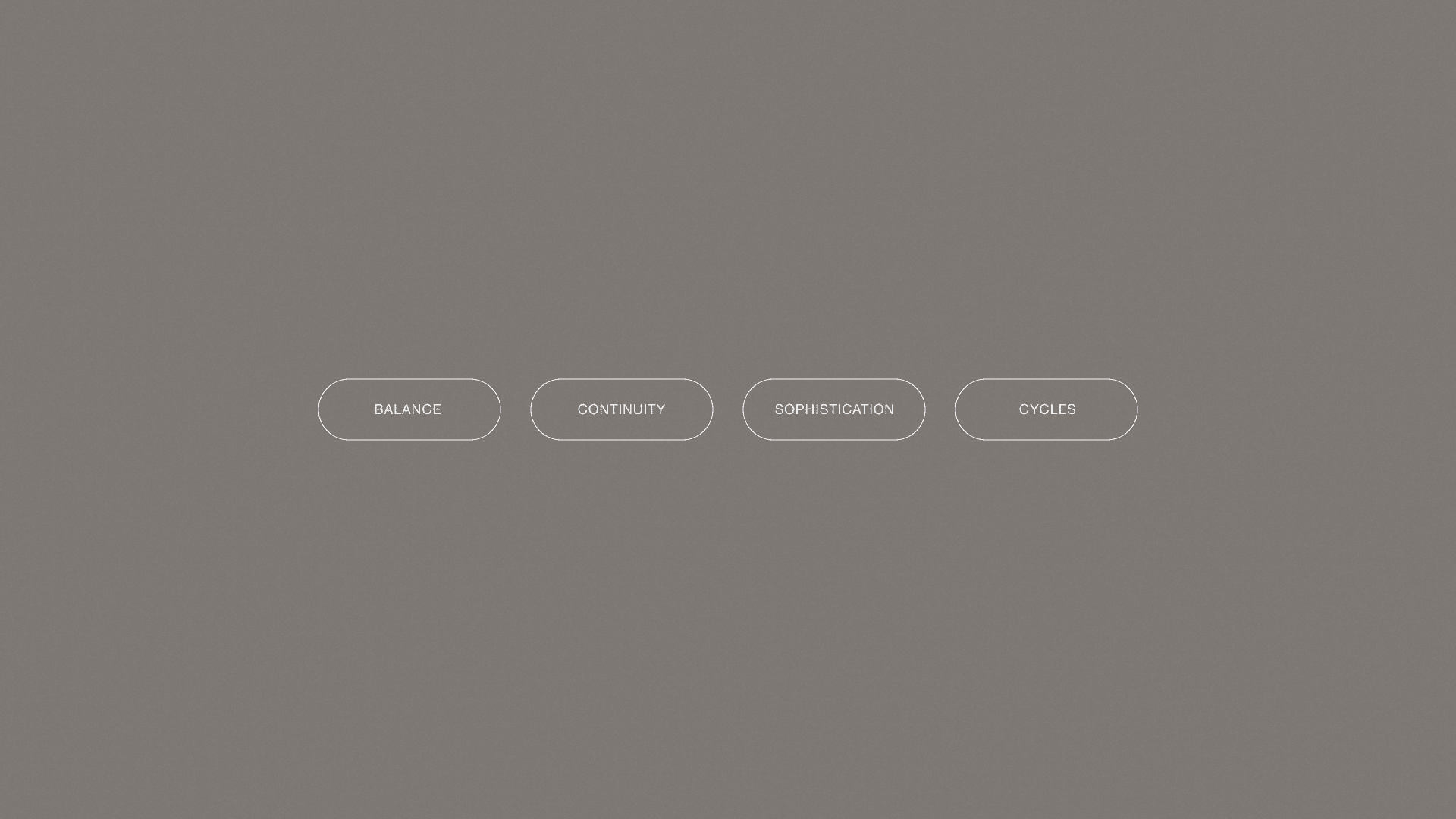
Dr. Carolina Puentes' visual identity stems from the balance between confidence and transformation. Inspired by her work that goes beyond aesthetics, the brand visually translates the care, excellence, and empathy she offers each patient. The symbol represents movement and acceptance, reflecting her holistic and human approach. With elegant lines and a sophisticated visual system, the identity reinforces the doctor's authority in her field, while inviting her patients to experience a light, safe, and inspiring process of change.
Dr. Carolina Puentes' visual identity stems from the balance between confidence and transformation. Inspired by her work that goes beyond aesthetics, the brand visually translates the care, excellence, and empathy she offers each patient. The symbol represents movement and acceptance, reflecting her holistic and human approach. With elegant lines and a sophisticated visual system, the identity reinforces the doctor's authority in her field, while inviting her patients to experience a light, safe, and inspiring process of change.

Logo
Logo
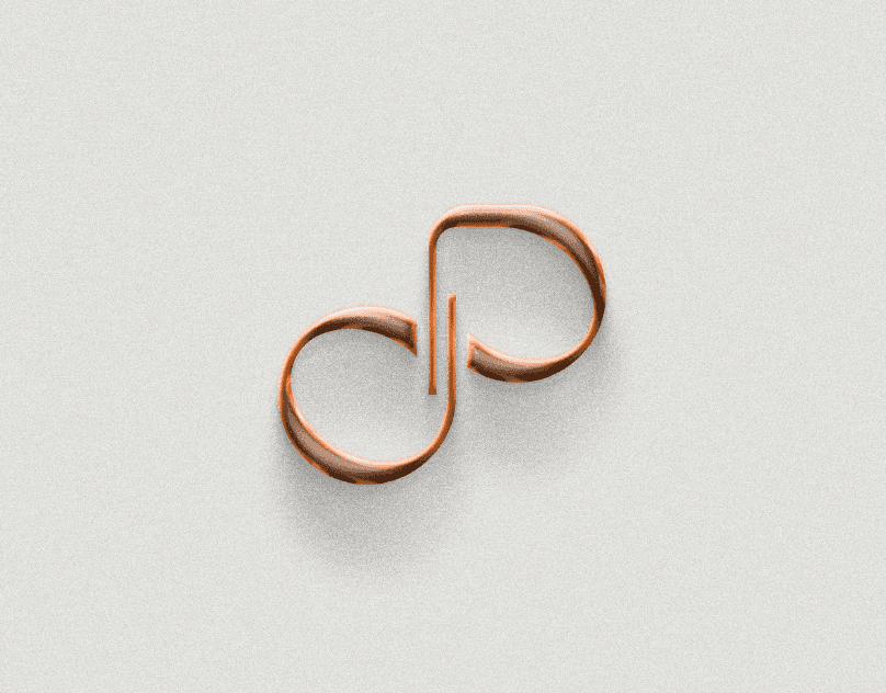
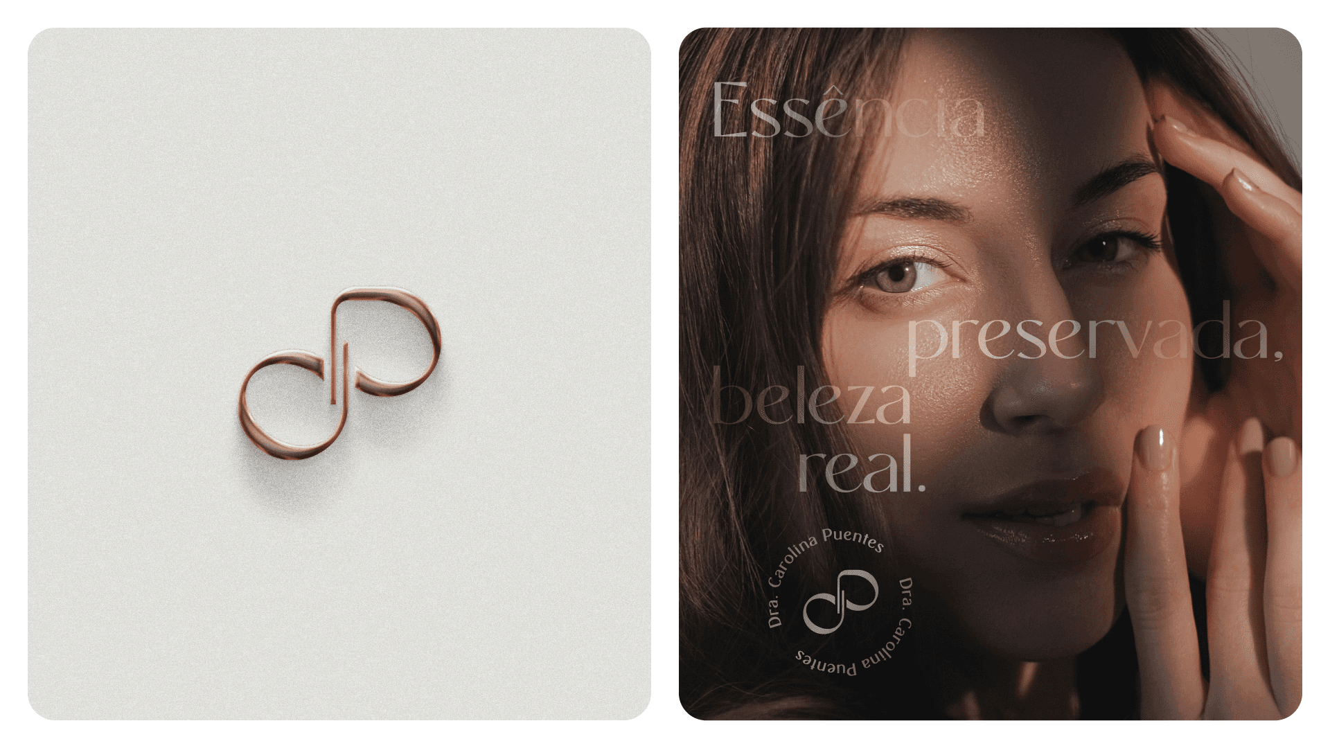
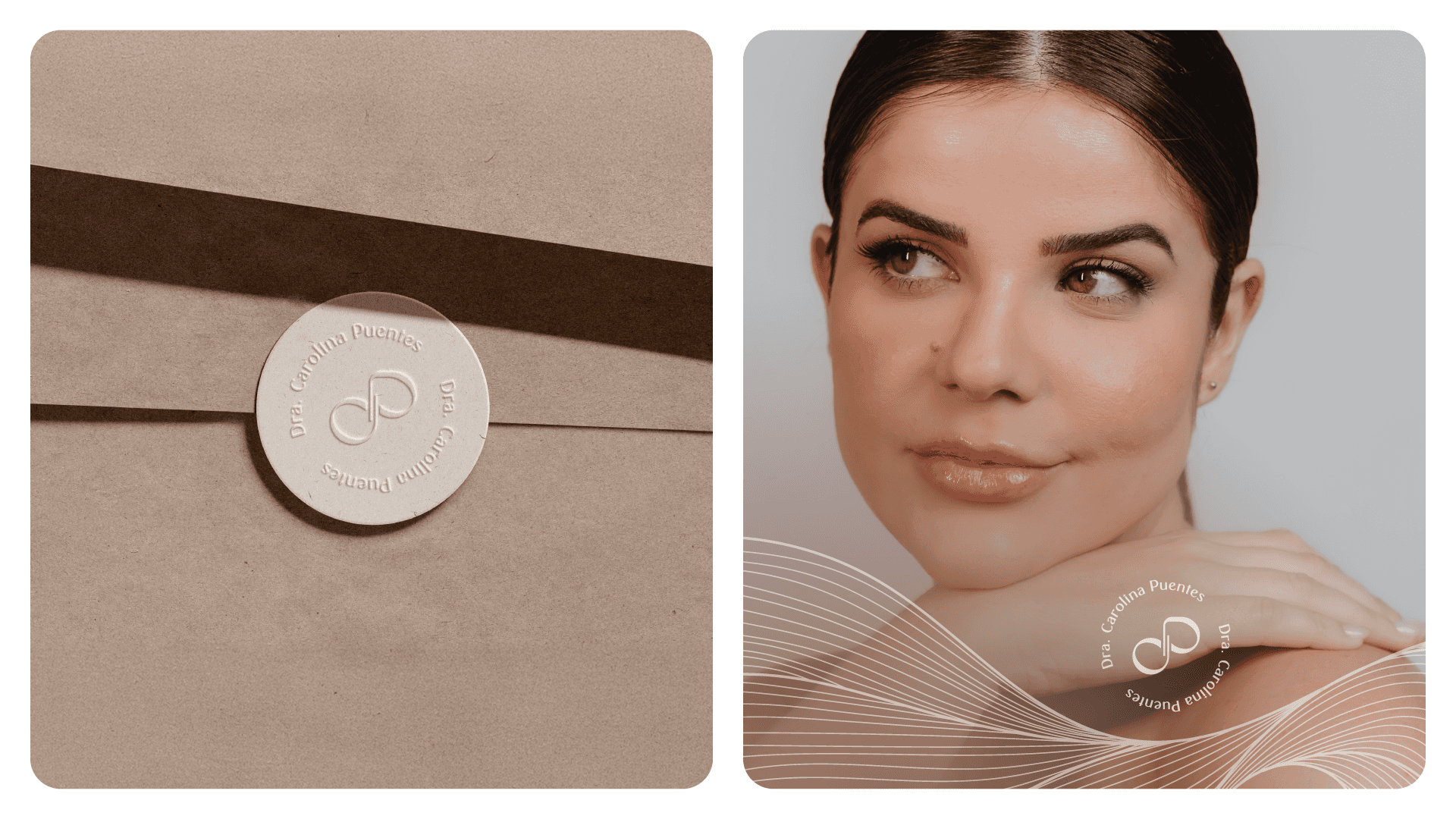
The symbol for Dr. Carolina Puentes is born from the union of the letters "C" and "P," which gently intertwine to form the silhouette of an infinity symbol, a visual representation of continuity, care, and trust that strengthen over time. The shape, with its fluid curves and delicate proportions, carries the sensitivity and sophistication that the brand seeks to convey. The letter "P" appears more prominently, while the "C" emerges subtly and abstractly, inviting interpretation and discovery, a reflection of Dr. Carolina's welcoming and non-obvious approach. With a clean and versatile structure, the symbol works both independently and alongside the logo, assuming the role of the brand's visual signature in a variety of contexts.
The symbol for Dr. Carolina Puentes is born from the union of the letters "C" and "P," which gently intertwine to form the silhouette of an infinity symbol, a visual representation of continuity, care, and trust that strengthen over time. The shape, with its fluid curves and delicate proportions, carries the sensitivity and sophistication that the brand seeks to convey. The letter "P" appears more prominently, while the "C" emerges subtly and abstractly, inviting interpretation and discovery, a reflection of Dr. Carolina's welcoming and non-obvious approach. With a clean and versatile structure, the symbol works both independently and alongside the logo, assuming the role of the brand's visual signature in a variety of contexts.

Visual Identity
Visual Identity
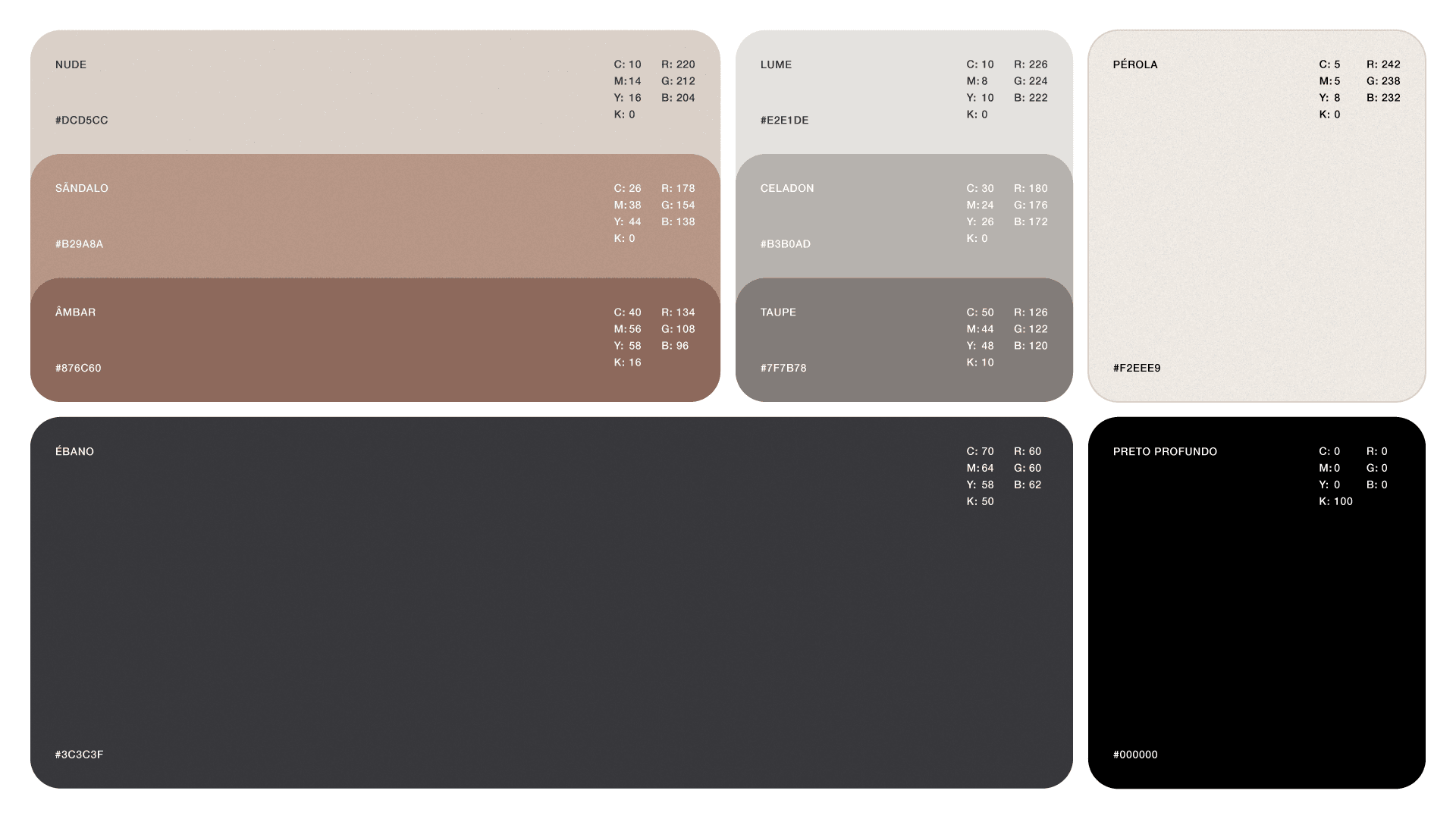
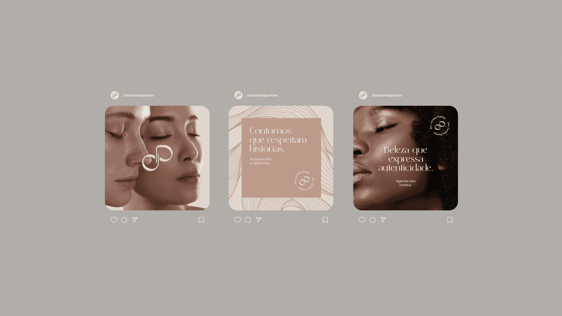
The visual identity of Dr. Carolina Puentes embodies the balance between technique and sensitivity. The color palette combines shades of gray and terracotta, symbolizing sophistication and warmth. Gray conveys professionalism and neutrality; terracotta, warmth and authenticity. The organic shapes present in the visual system were inspired by the logo symbol and the natural lines of human faces. They reinforce the idea of unique beauty, translating Dr. Carolina's sensitive and personalized perspective. The Rachelya and Uncut Sans typefaces bring refinement and clarity to the identity, while Quentin evokes handwriting and adds a human touch to the brand, a combination that balances tradition and contemporaneity. These elements complement each other in a cohesive visual system that communicates exclusivity, empathy, and technical excellence in every detail.
The visual identity of Dr. Carolina Puentes embodies the balance between technique and sensitivity. The color palette combines shades of gray and terracotta, symbolizing sophistication and warmth. Gray conveys professionalism and neutrality; terracotta, warmth and authenticity. The organic shapes present in the visual system were inspired by the logo symbol and the natural lines of human faces. They reinforce the idea of unique beauty, translating Dr. Carolina's sensitive and personalized perspective. The Rachelya and Uncut Sans typefaces bring refinement and clarity to the identity, while Quentin evokes handwriting and adds a human touch to the brand, a combination that balances tradition and contemporaneity. These elements complement each other in a cohesive visual system that communicates exclusivity, empathy, and technical excellence in every detail.


Credits
Credits
Creative Direction and Design: Matheus Ferreira Photoshoot: Matheus Boletti
( EXPLORE OUR WORK )
See More Projects…


matheusferreira.co
We specialize in strategically designed brands, visual identities, and packaging.
MATHEUS FERREIRA & CO
MATHEUS FERREIRA & CO • ALL RIGHTS RESERVED
© 2026
Dra. Carolina Puentes
Dra. Carolina Puentes
Client
Dra. Carolina Puentes
Year
2024
Location
Brazil
Dr. Carolina Puentes is a dental surgeon specializing in orofacial and body harmonization. Her brand was created to convey confidence, empathy, and excellence, valuing a human and transformative approach in every aspect of care. Working with a technical yet sensitive eye, Carolina seeks to promote self-esteem and well-being naturally and ethically, believing that true beauty is that which respects the essence of each person. The visual identity was built to reflect these pillars, with a light, sophisticated, and welcoming aesthetic. From the logo to the communication, every detail translates her philosophy: to enhance individual beauty with safety, precision, and empathy.
Dr. Carolina Puentes is a dental surgeon specializing in orofacial and body harmonization. Her brand was created to convey confidence, empathy, and excellence, valuing a human and transformative approach in every aspect of care. Working with a technical yet sensitive eye, Carolina seeks to promote self-esteem and well-being naturally and ethically, believing that true beauty is that which respects the essence of each person. The visual identity was built to reflect these pillars, with a light, sophisticated, and welcoming aesthetic. From the logo to the communication, every detail translates her philosophy: to enhance individual beauty with safety, precision, and empathy.
Concept
Concept
Dr. Carolina Puentes' visual identity stems from the balance between confidence and transformation. Inspired by her work that goes beyond aesthetics, the brand visually translates the care, excellence, and empathy she offers each patient. The symbol represents movement and acceptance, reflecting her holistic and human approach. With elegant lines and a sophisticated visual system, the identity reinforces the doctor's authority in her field, while inviting her patients to experience a light, safe, and inspiring process of change.
Dr. Carolina Puentes' visual identity stems from the balance between confidence and transformation. Inspired by her work that goes beyond aesthetics, the brand visually translates the care, excellence, and empathy she offers each patient. The symbol represents movement and acceptance, reflecting her holistic and human approach. With elegant lines and a sophisticated visual system, the identity reinforces the doctor's authority in her field, while inviting her patients to experience a light, safe, and inspiring process of change.
Logo
Logo
The symbol for Dr. Carolina Puentes is born from the union of the letters "C" and "P," which gently intertwine to form the silhouette of an infinity symbol, a visual representation of continuity, care, and trust that strengthen over time. The shape, with its fluid curves and delicate proportions, carries the sensitivity and sophistication that the brand seeks to convey. The letter "P" appears more prominently, while the "C" emerges subtly and abstractly, inviting interpretation and discovery, a reflection of Dr. Carolina's welcoming and non-obvious approach. With a clean and versatile structure, the symbol works both independently and alongside the logo, assuming the role of the brand's visual signature in a variety of contexts.
The symbol for Dr. Carolina Puentes is born from the union of the letters "C" and "P," which gently intertwine to form the silhouette of an infinity symbol, a visual representation of continuity, care, and trust that strengthen over time. The shape, with its fluid curves and delicate proportions, carries the sensitivity and sophistication that the brand seeks to convey. The letter "P" appears more prominently, while the "C" emerges subtly and abstractly, inviting interpretation and discovery, a reflection of Dr. Carolina's welcoming and non-obvious approach. With a clean and versatile structure, the symbol works both independently and alongside the logo, assuming the role of the brand's visual signature in a variety of contexts.
Visual Identity
Visual Identity
The visual identity of Dr. Carolina Puentes embodies the balance between technique and sensitivity. The color palette combines shades of gray and terracotta, symbolizing sophistication and warmth. Gray conveys professionalism and neutrality; terracotta, warmth and authenticity. The organic shapes present in the visual system were inspired by the logo symbol and the natural lines of human faces. They reinforce the idea of unique beauty, translating Dr. Carolina's sensitive and personalized perspective. The Rachelya and Uncut Sans typefaces bring refinement and clarity to the identity, while Quentin evokes handwriting and adds a human touch to the brand, a combination that balances tradition and contemporaneity. These elements complement each other in a cohesive visual system that communicates exclusivity, empathy, and technical excellence in every detail.
The visual identity of Dr. Carolina Puentes embodies the balance between technique and sensitivity. The color palette combines shades of gray and terracotta, symbolizing sophistication and warmth. Gray conveys professionalism and neutrality; terracotta, warmth and authenticity. The organic shapes present in the visual system were inspired by the logo symbol and the natural lines of human faces. They reinforce the idea of unique beauty, translating Dr. Carolina's sensitive and personalized perspective. The Rachelya and Uncut Sans typefaces bring refinement and clarity to the identity, while Quentin evokes handwriting and adds a human touch to the brand, a combination that balances tradition and contemporaneity. These elements complement each other in a cohesive visual system that communicates exclusivity, empathy, and technical excellence in every detail.
Credits
Credits
Creative Direction and Design: Matheus Ferreira Photoshoot: Matheus Boletti
( EXPLORE OUR WORK )
See More Projects…
matheusferreira.co
We specialize in strategically designed brands, visual identities, and packaging.
MATHEUS FERREIRA & CO
ALL RIGHTS RESERVED
© 2026