Ground Z
Ground Z
Client
Ground Z
Year
2024
Location
Oman
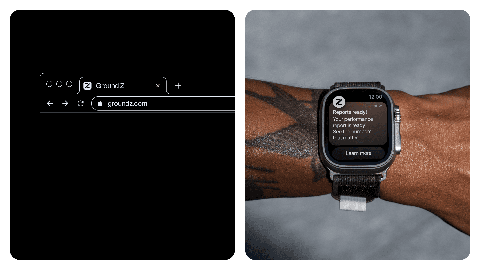
Ground Z is a strategic and creative agency specializing in the production of corporate events and digital solutions. With a focus on innovation, the brand was created with the purpose of raising the standard of creativity and excellence in the sector, offering tailored strategies that combine planning, action and impact. Working at the exact point where ideas, brands and objectives meet, Ground Z acts as a strategic starting point: the “ground zero” for businesses that want to stand out in the market with memorable, immersive and high-value experiences. More than creating, the agency transforms: it connects, drives and delivers results that really matter.
Ground Z is a strategic and creative agency specializing in the production of corporate events and digital solutions. With a focus on innovation, the brand was created with the purpose of raising the standard of creativity and excellence in the sector, offering tailored strategies that combine planning, action and impact. Working at the exact point where ideas, brands and objectives meet, Ground Z acts as a strategic starting point: the “ground zero” for businesses that want to stand out in the market with memorable, immersive and high-value experiences. More than creating, the agency transforms: it connects, drives and delivers results that really matter.

Concept
Concept
Ground Z’s visual identity was built based on the concept of “Zero Rising,” reflecting its role as a catalyst for movement, growth, and transformation. The project is based on the idea that every impactful result begins with a good starting point, and this is where Ground Z comes in: where strategy and creativity converge to give rise to progress. This essence is visually translated through elements that communicate fluidity, structure, and strategic energy, such as soft curves, vibrant gradients, multiplying squares, and clean, organized compositions. The identity strikes a balance between logic and visual expression, projecting the brand as solid, innovative, and in constant movement.
Ground Z’s visual identity was built based on the concept of “Zero Rising,” reflecting its role as a catalyst for movement, growth, and transformation. The project is based on the idea that every impactful result begins with a good starting point, and this is where Ground Z comes in: where strategy and creativity converge to give rise to progress. This essence is visually translated through elements that communicate fluidity, structure, and strategic energy, such as soft curves, vibrant gradients, multiplying squares, and clean, organized compositions. The identity strikes a balance between logic and visual expression, projecting the brand as solid, innovative, and in constant movement.

Logo
Logo
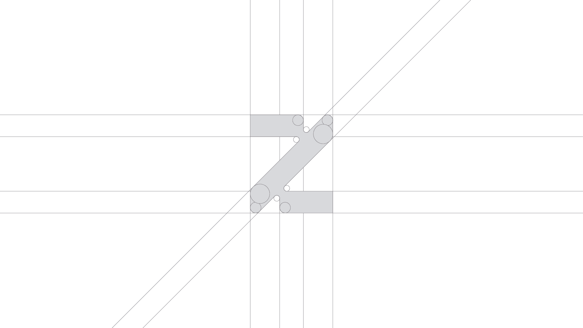
The Ground Z symbol is a modular Z, built from a geometric grid, with interconnected parts that represent planning, collaboration and continuous progress. The structure refers to the agency's strategic thinking, while the arrow shape embedded in the composition suggests direction, ascension and action. The sans serif typography, clear and objective, brings seriousness, modernity and precision to the brand. Its contrast with the symbol, more expressive and dynamic, creates a visual balance that reinforces the two sides of Ground Z: solid strategy and creativity in motion.
The Ground Z symbol is a modular Z, built from a geometric grid, with interconnected parts that represent planning, collaboration and continuous progress. The structure refers to the agency's strategic thinking, while the arrow shape embedded in the composition suggests direction, ascension and action. The sans serif typography, clear and objective, brings seriousness, modernity and precision to the brand. Its contrast with the symbol, more expressive and dynamic, creates a visual balance that reinforces the two sides of Ground Z: solid strategy and creativity in motion.

Visual Identity
Visual Identity
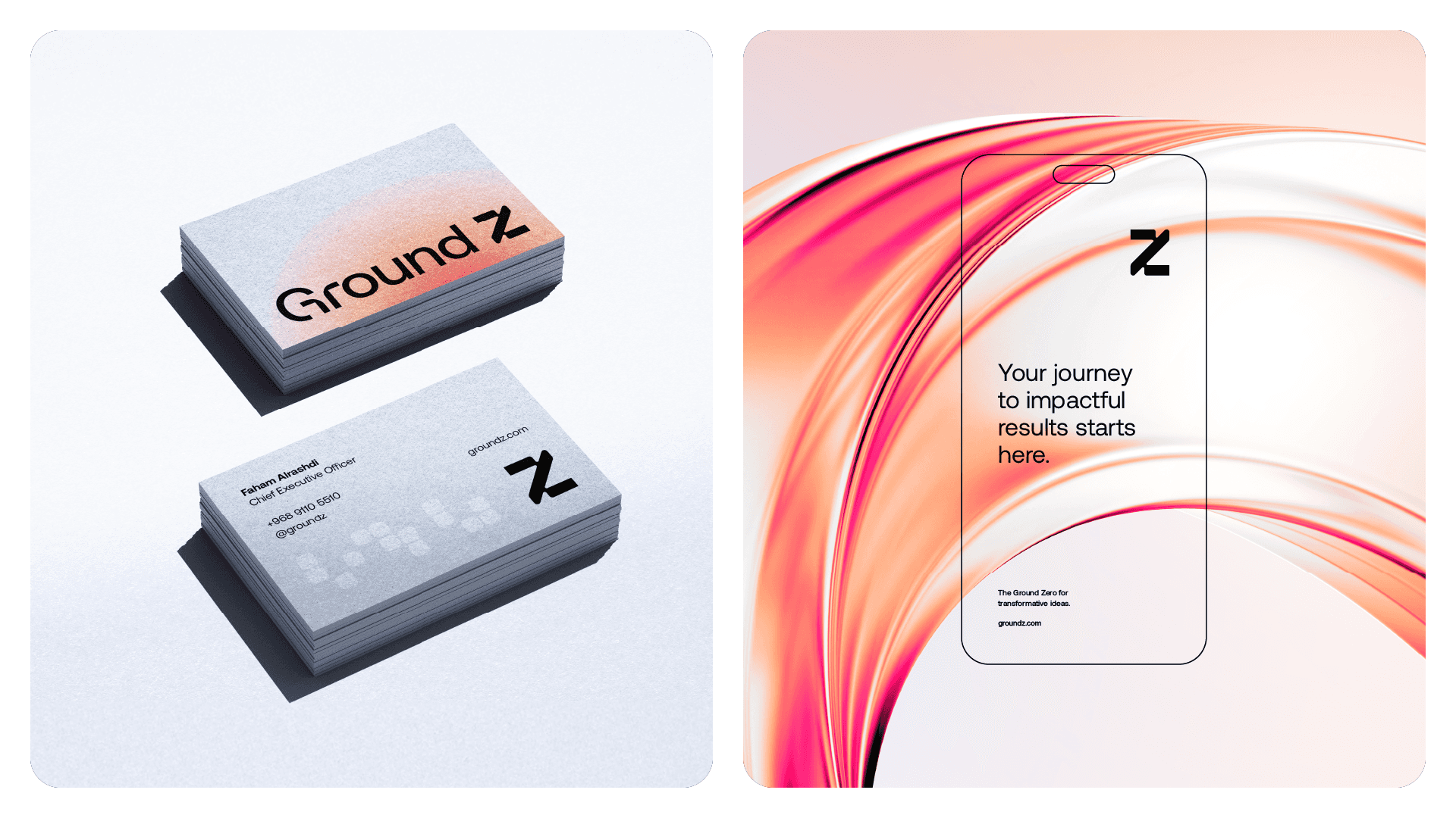
Ground Z's visual identity is based on modular shapes, fluid curves and well-structured compositions, graphically translating the brand's pillars. The color palette, composed of intense red, light orange, light blue and dark gray, balances energy, creativity and confidence. The ice tone and black serve as a base to highlight the main palette, maintaining sophistication and legibility. Graphic elements derived from the symbol are used to create flexible and functional layouts, which adapt to different formats without losing consistency. This approach generates a proprietary visual language, which conveys dynamism and reinforces Ground Z's role as a point of convergence between ideas and results.
Ground Z's visual identity is based on modular shapes, fluid curves and well-structured compositions, graphically translating the brand's pillars. The color palette, composed of intense red, light orange, light blue and dark gray, balances energy, creativity and confidence. The ice tone and black serve as a base to highlight the main palette, maintaining sophistication and legibility. Graphic elements derived from the symbol are used to create flexible and functional layouts, which adapt to different formats without losing consistency. This approach generates a proprietary visual language, which conveys dynamism and reinforces Ground Z's role as a point of convergence between ideas and results.


Credits
Credits
Creative Direction and Design: Matheus Ferreira
( EXPLORE OUR WORK )
See More Projects…


matheusferreira.co
We specialize in strategically designed brands, visual identities, and packaging.
MATHEUS FERREIRA & CO
MATHEUS FERREIRA & CO • ALL RIGHTS RESERVED
© 2026
Ground Z
Ground Z
Client
Ground Z
Year
2024
Location
Oman
Ground Z is a strategic and creative agency specializing in the production of corporate events and digital solutions. With a focus on innovation, the brand was created with the purpose of raising the standard of creativity and excellence in the sector, offering tailored strategies that combine planning, action and impact. Working at the exact point where ideas, brands and objectives meet, Ground Z acts as a strategic starting point: the “ground zero” for businesses that want to stand out in the market with memorable, immersive and high-value experiences. More than creating, the agency transforms: it connects, drives and delivers results that really matter.
Ground Z is a strategic and creative agency specializing in the production of corporate events and digital solutions. With a focus on innovation, the brand was created with the purpose of raising the standard of creativity and excellence in the sector, offering tailored strategies that combine planning, action and impact. Working at the exact point where ideas, brands and objectives meet, Ground Z acts as a strategic starting point: the “ground zero” for businesses that want to stand out in the market with memorable, immersive and high-value experiences. More than creating, the agency transforms: it connects, drives and delivers results that really matter.
Concept
Concept
Ground Z’s visual identity was built based on the concept of “Zero Rising,” reflecting its role as a catalyst for movement, growth, and transformation. The project is based on the idea that every impactful result begins with a good starting point, and this is where Ground Z comes in: where strategy and creativity converge to give rise to progress. This essence is visually translated through elements that communicate fluidity, structure, and strategic energy, such as soft curves, vibrant gradients, multiplying squares, and clean, organized compositions. The identity strikes a balance between logic and visual expression, projecting the brand as solid, innovative, and in constant movement.
Ground Z’s visual identity was built based on the concept of “Zero Rising,” reflecting its role as a catalyst for movement, growth, and transformation. The project is based on the idea that every impactful result begins with a good starting point, and this is where Ground Z comes in: where strategy and creativity converge to give rise to progress. This essence is visually translated through elements that communicate fluidity, structure, and strategic energy, such as soft curves, vibrant gradients, multiplying squares, and clean, organized compositions. The identity strikes a balance between logic and visual expression, projecting the brand as solid, innovative, and in constant movement.
Logo
Logo
The Ground Z symbol is a modular Z, built from a geometric grid, with interconnected parts that represent planning, collaboration and continuous progress. The structure refers to the agency's strategic thinking, while the arrow shape embedded in the composition suggests direction, ascension and action. The sans serif typography, clear and objective, brings seriousness, modernity and precision to the brand. Its contrast with the symbol, more expressive and dynamic, creates a visual balance that reinforces the two sides of Ground Z: solid strategy and creativity in motion.
The Ground Z symbol is a modular Z, built from a geometric grid, with interconnected parts that represent planning, collaboration and continuous progress. The structure refers to the agency's strategic thinking, while the arrow shape embedded in the composition suggests direction, ascension and action. The sans serif typography, clear and objective, brings seriousness, modernity and precision to the brand. Its contrast with the symbol, more expressive and dynamic, creates a visual balance that reinforces the two sides of Ground Z: solid strategy and creativity in motion.
Visual Identity
Visual Identity
Ground Z's visual identity is based on modular shapes, fluid curves and well-structured compositions, graphically translating the brand's pillars. The color palette, composed of intense red, light orange, light blue and dark gray, balances energy, creativity and confidence. The ice tone and black serve as a base to highlight the main palette, maintaining sophistication and legibility. Graphic elements derived from the symbol are used to create flexible and functional layouts, which adapt to different formats without losing consistency. This approach generates a proprietary visual language, which conveys dynamism and reinforces Ground Z's role as a point of convergence between ideas and results.
Ground Z's visual identity is based on modular shapes, fluid curves and well-structured compositions, graphically translating the brand's pillars. The color palette, composed of intense red, light orange, light blue and dark gray, balances energy, creativity and confidence. The ice tone and black serve as a base to highlight the main palette, maintaining sophistication and legibility. Graphic elements derived from the symbol are used to create flexible and functional layouts, which adapt to different formats without losing consistency. This approach generates a proprietary visual language, which conveys dynamism and reinforces Ground Z's role as a point of convergence between ideas and results.
Credits
Credits
Creative Direction and Design: Matheus Ferreira
( EXPLORE OUR WORK )
See More Projects…
matheusferreira.co
We specialize in strategically designed brands, visual identities, and packaging.
MATHEUS FERREIRA & CO
ALL RIGHTS RESERVED
© 2026