J1 STUDIO
J1 STUDIO
Client
J1 STUDIO
Year
2024
Location
Brazil
J1 STUDIO is a company specialized in developing high-performance WordPress projects, with digital solutions that combine technology, strategy and agility. Focused on performance and innovation, the brand was created to offer services that combine technical expertise and precision. More than just developing websites, J1 STUDIO structures robust, efficient and scalable digital presences. Its work is based on the belief that technology should drive growth, with a solid structure, rapid adaptation and measurable results. Alongside its clients, it acts as a strategic partner that codifies ideas and drives business in the digital environment.
J1 STUDIO is a company specialized in developing high-performance WordPress projects, with digital solutions that combine technology, strategy and agility. Focused on performance and innovation, the brand was created to offer services that combine technical expertise and precision. More than just developing websites, J1 STUDIO structures robust, efficient and scalable digital presences. Its work is based on the belief that technology should drive growth, with a solid structure, rapid adaptation and measurable results. Alongside its clients, it acts as a strategic partner that codifies ideas and drives business in the digital environment.

Concept
Concept
J1 STUDIO's visual identity was conceived based on the concept of “Coding the Movement”, visually translating the fusion between technological performance, innovation and fluidity. The project is based on the idea that, just as a processor optimizes and executes multiple tasks with precision, J1 STUDIO is the core behind its clients’ digital solutions: moving brands with speed, intelligence and security. This concept is materialized in a visual universe that balances minimalism and impact: diagonals that refer to the agility of digital systems, rectangular shapes inspired by computer chips and a clear, solid and contemporary typography. Everything communicates not only technical mastery, but also adaptability, applied intelligence and strategic vision.
J1 STUDIO's visual identity was conceived based on the concept of “Coding the Movement”, visually translating the fusion between technological performance, innovation and fluidity. The project is based on the idea that, just as a processor optimizes and executes multiple tasks with precision, J1 STUDIO is the core behind its clients’ digital solutions: moving brands with speed, intelligence and security. This concept is materialized in a visual universe that balances minimalism and impact: diagonals that refer to the agility of digital systems, rectangular shapes inspired by computer chips and a clear, solid and contemporary typography. Everything communicates not only technical mastery, but also adaptability, applied intelligence and strategic vision.

Logo
Logo
The J1 STUDIO symbol is the abstract combination of the letter “J” and the number “1”, representing the idea of uniqueness, reference and expertise, a choice that values the legibility of a letter and number with such similar shapes. Built based on a modular grid, the logo features diagonal cuts and angles strategically designed to convey agility, fluidity and precision. The sans serif typography in uppercase follows the language of the symbol, with a lighter thickness and discreet presence, creating a visual balance between strength and lightness. The diagonal cut in the “D” connects directly to the visual language of the icon, unifying the elements in a unique and proprietary signature.
The J1 STUDIO symbol is the abstract combination of the letter “J” and the number “1”, representing the idea of uniqueness, reference and expertise, a choice that values the legibility of a letter and number with such similar shapes. Built based on a modular grid, the logo features diagonal cuts and angles strategically designed to convey agility, fluidity and precision. The sans serif typography in uppercase follows the language of the symbol, with a lighter thickness and discreet presence, creating a visual balance between strength and lightness. The diagonal cut in the “D” connects directly to the visual language of the icon, unifying the elements in a unique and proprietary signature.


Visual Identity
Visual Identity
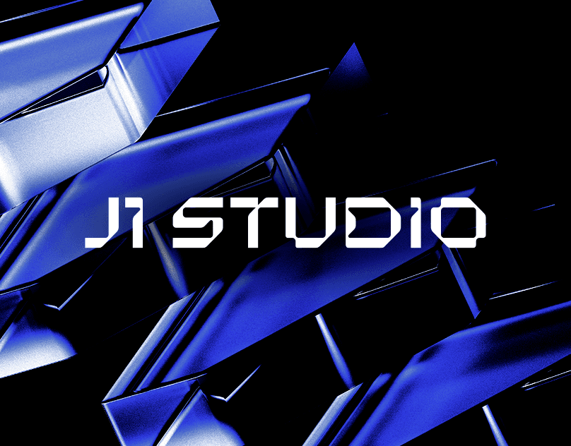
The visual identity of J1 STUDIO is composed of graphic elements that refer to the world of technology and performance. Shapes with diagonal corners, rectangular shapes and well-structured compositions create a language that expresses innovation and versatility. The color palette combines black with vibrant shades of blue, communicating sophistication, solidity and digital intelligence. The applications explore light textures and glassmorphism in 3D renders, referring to the performance of interfaces and the contemporary aesthetics of tech products. This visual construction consolidates J1 STUDIO as a brand with a strong presence, which combines technical expertise and strategic sensitivity to offer high-performance digital solutions.
The visual identity of J1 STUDIO is composed of graphic elements that refer to the world of technology and performance. Shapes with diagonal corners, rectangular shapes and well-structured compositions create a language that expresses innovation and versatility. The color palette combines black with vibrant shades of blue, communicating sophistication, solidity and digital intelligence. The applications explore light textures and glassmorphism in 3D renders, referring to the performance of interfaces and the contemporary aesthetics of tech products. This visual construction consolidates J1 STUDIO as a brand with a strong presence, which combines technical expertise and strategic sensitivity to offer high-performance digital solutions.


Credits
Credits
Creative Direction and Design: Matheus Ferreira 3D Rendering: Vinícius Monteiro
( EXPLORE OUR WORK )
See More Projects…


matheusferreira.co
We specialize in strategically designed brands, visual identities, and packaging.
MATHEUS FERREIRA & CO
MATHEUS FERREIRA & CO • ALL RIGHTS RESERVED
© 2026
J1 STUDIO
J1 STUDIO
Client
J1 STUDIO
Year
2024
Location
Brazil
J1 STUDIO is a company specialized in developing high-performance WordPress projects, with digital solutions that combine technology, strategy and agility. Focused on performance and innovation, the brand was created to offer services that combine technical expertise and precision. More than just developing websites, J1 STUDIO structures robust, efficient and scalable digital presences. Its work is based on the belief that technology should drive growth, with a solid structure, rapid adaptation and measurable results. Alongside its clients, it acts as a strategic partner that codifies ideas and drives business in the digital environment.
J1 STUDIO is a company specialized in developing high-performance WordPress projects, with digital solutions that combine technology, strategy and agility. Focused on performance and innovation, the brand was created to offer services that combine technical expertise and precision. More than just developing websites, J1 STUDIO structures robust, efficient and scalable digital presences. Its work is based on the belief that technology should drive growth, with a solid structure, rapid adaptation and measurable results. Alongside its clients, it acts as a strategic partner that codifies ideas and drives business in the digital environment.
Concept
Concept
J1 STUDIO's visual identity was conceived based on the concept of “Coding the Movement”, visually translating the fusion between technological performance, innovation and fluidity. The project is based on the idea that, just as a processor optimizes and executes multiple tasks with precision, J1 STUDIO is the core behind its clients’ digital solutions: moving brands with speed, intelligence and security. This concept is materialized in a visual universe that balances minimalism and impact: diagonals that refer to the agility of digital systems, rectangular shapes inspired by computer chips and a clear, solid and contemporary typography. Everything communicates not only technical mastery, but also adaptability, applied intelligence and strategic vision.
J1 STUDIO's visual identity was conceived based on the concept of “Coding the Movement”, visually translating the fusion between technological performance, innovation and fluidity. The project is based on the idea that, just as a processor optimizes and executes multiple tasks with precision, J1 STUDIO is the core behind its clients’ digital solutions: moving brands with speed, intelligence and security. This concept is materialized in a visual universe that balances minimalism and impact: diagonals that refer to the agility of digital systems, rectangular shapes inspired by computer chips and a clear, solid and contemporary typography. Everything communicates not only technical mastery, but also adaptability, applied intelligence and strategic vision.
Logo
Logo
The J1 STUDIO symbol is the abstract combination of the letter “J” and the number “1”, representing the idea of uniqueness, reference and expertise, a choice that values the legibility of a letter and number with such similar shapes. Built based on a modular grid, the logo features diagonal cuts and angles strategically designed to convey agility, fluidity and precision. The sans serif typography in uppercase follows the language of the symbol, with a lighter thickness and discreet presence, creating a visual balance between strength and lightness. The diagonal cut in the “D” connects directly to the visual language of the icon, unifying the elements in a unique and proprietary signature.
The J1 STUDIO symbol is the abstract combination of the letter “J” and the number “1”, representing the idea of uniqueness, reference and expertise, a choice that values the legibility of a letter and number with such similar shapes. Built based on a modular grid, the logo features diagonal cuts and angles strategically designed to convey agility, fluidity and precision. The sans serif typography in uppercase follows the language of the symbol, with a lighter thickness and discreet presence, creating a visual balance between strength and lightness. The diagonal cut in the “D” connects directly to the visual language of the icon, unifying the elements in a unique and proprietary signature.
Visual Identity
Visual Identity
The visual identity of J1 STUDIO is composed of graphic elements that refer to the world of technology and performance. Shapes with diagonal corners, rectangular shapes and well-structured compositions create a language that expresses innovation and versatility. The color palette combines black with vibrant shades of blue, communicating sophistication, solidity and digital intelligence. The applications explore light textures and glassmorphism in 3D renders, referring to the performance of interfaces and the contemporary aesthetics of tech products. This visual construction consolidates J1 STUDIO as a brand with a strong presence, which combines technical expertise and strategic sensitivity to offer high-performance digital solutions.
The visual identity of J1 STUDIO is composed of graphic elements that refer to the world of technology and performance. Shapes with diagonal corners, rectangular shapes and well-structured compositions create a language that expresses innovation and versatility. The color palette combines black with vibrant shades of blue, communicating sophistication, solidity and digital intelligence. The applications explore light textures and glassmorphism in 3D renders, referring to the performance of interfaces and the contemporary aesthetics of tech products. This visual construction consolidates J1 STUDIO as a brand with a strong presence, which combines technical expertise and strategic sensitivity to offer high-performance digital solutions.
Credits
Credits
Creative Direction and Design: Matheus Ferreira 3D Rendering: Vinícius Monteiro
( EXPLORE OUR WORK )
See More Projects…
matheusferreira.co
We specialize in strategically designed brands, visual identities, and packaging.
MATHEUS FERREIRA & CO
ALL RIGHTS RESERVED
© 2026