SNACK
SNACK
Client
SNACK
Year
2023
Location
Brazil
SNACK is an innovative platform in the blockchain sector, focused on creating immersive and unique experiences. Acting as a services and technology hub, connecting people and companies within the Web3 and blockchain universe, with a focus on democratizing access to new technologies, offering solutions that range from personalizing services to creating communities.
SNACK is an innovative platform in the blockchain sector, focused on creating immersive and unique experiences. Acting as a services and technology hub, connecting people and companies within the Web3 and blockchain universe, with a focus on democratizing access to new technologies, offering solutions that range from personalizing services to creating communities.

Concept
Concept
SNACK’s visual concept has been carefully developed to reflect its visual attributes. Each visual element conveys SNACK’s commitment to creating revolutionary experiences, while the modern and dynamic design ensures the brand remains relevant and engaging, maintaining an open dialogue with young audiences and the business market.
SNACK’s visual concept has been carefully developed to reflect its visual attributes. Each visual element conveys SNACK’s commitment to creating revolutionary experiences, while the modern and dynamic design ensures the brand remains relevant and engaging, maintaining an open dialogue with young audiences and the business market.

Logo
Logo
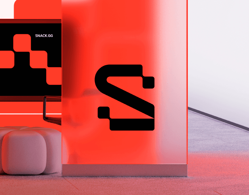
The SNACK logo was developed to symbolize the innovative nature and connection between people within the blockchain. Inspired by the structure of the blockchain itself, the logo features square and rectangular shapes, connected harmoniously, representing data blocks and their connections. The letter “S”, which acts as the brand’s icon, features cuts and shapes inspired by blockchain blocks, reflecting the concept of innovation and connection between communities. The exclusive typography was built based on a modular grid, balancing curved and straight shapes to convey modernity and proximity, but always with the sophistication needed to reflect the seriousness of the services offered by SNACK. These elements guarantee a robust and versatile visual identity, capable of being applied in different contexts and formats, without losing its essence.
The SNACK logo was developed to symbolize the innovative nature and connection between people within the blockchain. Inspired by the structure of the blockchain itself, the logo features square and rectangular shapes, connected harmoniously, representing data blocks and their connections. The letter “S”, which acts as the brand’s icon, features cuts and shapes inspired by blockchain blocks, reflecting the concept of innovation and connection between communities. The exclusive typography was built based on a modular grid, balancing curved and straight shapes to convey modernity and proximity, but always with the sophistication needed to reflect the seriousness of the services offered by SNACK. These elements guarantee a robust and versatile visual identity, capable of being applied in different contexts and formats, without losing its essence.


Visual Identity
Visual Identity
SNACK’s color palette was designed to evoke a sense of energy, innovation, and solidity. The intense red represents the brand’s passion and dynamism, while black adds a touch of sophistication and seriousness. Purple brings the idea of creativity and transformation, while citrus yellow injects vibrancy and optimism. Gray, in turn, creates visual balance, reinforcing the idea of stability and trust. The typography chosen for SNACK is a modern and personalized sans-serif, which ensures clear and striking reading in any context. Its geometric and minimalist shapes complement the other elements of the visual identity, ensuring that the brand stands out in a professional and contemporary way. In this way, SNACK’s logo, typography, and color palette communicate the brand’s core values. These elements reflect the brand’s commitment to offering cutting-edge solutions for the blockchain market, while establishing a strong, vibrant, and future-oriented visual presence.
SNACK’s color palette was designed to evoke a sense of energy, innovation, and solidity. The intense red represents the brand’s passion and dynamism, while black adds a touch of sophistication and seriousness. Purple brings the idea of creativity and transformation, while citrus yellow injects vibrancy and optimism. Gray, in turn, creates visual balance, reinforcing the idea of stability and trust. The typography chosen for SNACK is a modern and personalized sans-serif, which ensures clear and striking reading in any context. Its geometric and minimalist shapes complement the other elements of the visual identity, ensuring that the brand stands out in a professional and contemporary way. In this way, SNACK’s logo, typography, and color palette communicate the brand’s core values. These elements reflect the brand’s commitment to offering cutting-edge solutions for the blockchain market, while establishing a strong, vibrant, and future-oriented visual presence.


Credits
Credits
Creative Direction and Art Direction: Matheus Ferreira
( EXPLORE OUR WORK )
See More Projects…


matheusferreira.co
We specialize in strategically designed brands, visual identities, and packaging.
MATHEUS FERREIRA & CO
MATHEUS FERREIRA & CO • ALL RIGHTS RESERVED
© 2026
SNACK
SNACK
Client
SNACK
Year
2023
Location
Brazil
SNACK is an innovative platform in the blockchain sector, focused on creating immersive and unique experiences. Acting as a services and technology hub, connecting people and companies within the Web3 and blockchain universe, with a focus on democratizing access to new technologies, offering solutions that range from personalizing services to creating communities.
SNACK is an innovative platform in the blockchain sector, focused on creating immersive and unique experiences. Acting as a services and technology hub, connecting people and companies within the Web3 and blockchain universe, with a focus on democratizing access to new technologies, offering solutions that range from personalizing services to creating communities.
Concept
Concept
SNACK’s visual concept has been carefully developed to reflect its visual attributes. Each visual element conveys SNACK’s commitment to creating revolutionary experiences, while the modern and dynamic design ensures the brand remains relevant and engaging, maintaining an open dialogue with young audiences and the business market.
SNACK’s visual concept has been carefully developed to reflect its visual attributes. Each visual element conveys SNACK’s commitment to creating revolutionary experiences, while the modern and dynamic design ensures the brand remains relevant and engaging, maintaining an open dialogue with young audiences and the business market.
Logo
Logo
The SNACK logo was developed to symbolize the innovative nature and connection between people within the blockchain. Inspired by the structure of the blockchain itself, the logo features square and rectangular shapes, connected harmoniously, representing data blocks and their connections. The letter “S”, which acts as the brand’s icon, features cuts and shapes inspired by blockchain blocks, reflecting the concept of innovation and connection between communities. The exclusive typography was built based on a modular grid, balancing curved and straight shapes to convey modernity and proximity, but always with the sophistication needed to reflect the seriousness of the services offered by SNACK. These elements guarantee a robust and versatile visual identity, capable of being applied in different contexts and formats, without losing its essence.
The SNACK logo was developed to symbolize the innovative nature and connection between people within the blockchain. Inspired by the structure of the blockchain itself, the logo features square and rectangular shapes, connected harmoniously, representing data blocks and their connections. The letter “S”, which acts as the brand’s icon, features cuts and shapes inspired by blockchain blocks, reflecting the concept of innovation and connection between communities. The exclusive typography was built based on a modular grid, balancing curved and straight shapes to convey modernity and proximity, but always with the sophistication needed to reflect the seriousness of the services offered by SNACK. These elements guarantee a robust and versatile visual identity, capable of being applied in different contexts and formats, without losing its essence.
Visual Identity
Visual Identity
SNACK’s color palette was designed to evoke a sense of energy, innovation, and solidity. The intense red represents the brand’s passion and dynamism, while black adds a touch of sophistication and seriousness. Purple brings the idea of creativity and transformation, while citrus yellow injects vibrancy and optimism. Gray, in turn, creates visual balance, reinforcing the idea of stability and trust. The typography chosen for SNACK is a modern and personalized sans-serif, which ensures clear and striking reading in any context. Its geometric and minimalist shapes complement the other elements of the visual identity, ensuring that the brand stands out in a professional and contemporary way. In this way, SNACK’s logo, typography, and color palette communicate the brand’s core values. These elements reflect the brand’s commitment to offering cutting-edge solutions for the blockchain market, while establishing a strong, vibrant, and future-oriented visual presence.
SNACK’s color palette was designed to evoke a sense of energy, innovation, and solidity. The intense red represents the brand’s passion and dynamism, while black adds a touch of sophistication and seriousness. Purple brings the idea of creativity and transformation, while citrus yellow injects vibrancy and optimism. Gray, in turn, creates visual balance, reinforcing the idea of stability and trust. The typography chosen for SNACK is a modern and personalized sans-serif, which ensures clear and striking reading in any context. Its geometric and minimalist shapes complement the other elements of the visual identity, ensuring that the brand stands out in a professional and contemporary way. In this way, SNACK’s logo, typography, and color palette communicate the brand’s core values. These elements reflect the brand’s commitment to offering cutting-edge solutions for the blockchain market, while establishing a strong, vibrant, and future-oriented visual presence.
Credits
Credits
Creative Direction and Art Direction: Matheus Ferreira
( EXPLORE OUR WORK )
See More Projects…
matheusferreira.co
We specialize in strategically designed brands, visual identities, and packaging.
MATHEUS FERREIRA & CO
ALL RIGHTS RESERVED
© 2026